Accessibility Best Practice: Designing For Disabilities
Updated: August 23, 2024
It’s no surprise that there’s a lot of content out there. Whether it be videos, images, or text, “American adults spend over 11 hours per day listening to, watching, reading or generally interacting with media.” That’s right – the average American adult spends nearly half of their day consuming content.
For many, this content connects them to each other and the world around them – it provides information and entertainment. For those who are d/Deaf, hard of hearing, blind, or low vision, much of this content is inaccessible and can therefore create more barriers than connections. As a content creator, there are many ways to make content more accessible and enjoyable for everyone.
Images
The saying goes, “a picture is worth a thousand words.” When it comes to accessibility, this is a really important statement to keep in mind. Pictures and other images give information and can help tell a story. Unless you are including an image simply for aesthetics, make sure that any image in your content is described accurately and clearly for someone with vision loss to access it in other ways.
Alt text
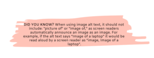
One way to make images more accessible is by including descriptions. Alternative text (alt text) is used to describe the image and allows screen readers to read the description so that blind and low vision viewers can consume the content. Any old description won’t do, however. When writing alt text, make sure it’s usable and functional for the website visitor. For example, consider whether writing “logo” accurately describe the image or if you can use more descriptive language. Alt text should also be clear and concise – descriptions should be about 120 characters or less.
Long Description

In this example bar chart, the alt text would appear as <img class="aligncenter" src="chart.png" alt="Bar Chart of Captioning Budget" /> and the long description would read: In 2017, 16% of organizations had an annual captioning budget over $10,000, and in 2018 32% of organizations had an annual captioning budget over $10,000.
Let’s Talk About GIFs
New WCAG 2.1 standards require users to have the capability to turn off animations unless the animation is essential to the functionality or information being conveyed. This guideline is designed to protect people with vestibular disorders who may get dizzy, nauseous, or distracted from unnecessary movement.
With this standard in mind, you should be wary of GIFs (automatic looped animations) as there is no way to turn them off. When designing GIFs it is critical to consider the best practices below, as failing to do so could result in headaches or seizures for some viewers.
If you decide to include GIFs, consider ways to make them more accessible. Some ways to do this are to include sufficient description in the alt text of the GIF. Additionally, avoid anything that flashes more than three times per second. This will ensure that any existing blinks or flashes are within the safe threshold. To check the accessibility of your GIFs, use the Photosensitive Epilepsy Analysis Tool.
Video
Audio Description
Audio description is a critical accommodation for individuals who are blind or low vision. It is a descriptive audio track that narrates the visual content out loud. Just like alt text is used to describe still images, audio description provides access to visuals in videos.
In addition to being an accommodation for individuals with visual impairments, audio description can benefit those on the Autism spectrum, auditory learners, and children who are learning language skills. Providing audio description on your video content not only makes it accessible but is actually the law!
Captions and Transcripts
Closed captions are time-synchronized text that can be read along with the video. Originally an accommodation for deaf and hard of hearing viewers, this tool has proven useful in many additional circumstances. Captioning your video content makes it more accessible to individuals who are deaf or hard of hearing, as well as those who are watching in sounds-free environments.
Transcripts are a plain text version of the audio. While it’s not time synchronized, transcripts can still be very helpful. Many students and other individuals find transcripts useful for following along as well as for reference later on.
Text
Talking about accessible text may sound a bit strange. Formatting and styling can have a big impact on how accessible text is to individuals with disabilities.
Headings
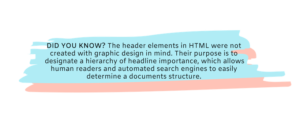
It may come as a surprise that headings are not meant to help with the visual appeal of your text, but rather to organize the structure of your content. Screen readers announce headings and identify the heading level for example, by reading <h1> headings as “heading level 1.”
When you land on a long website page, you likely find yourself scrolling down to quickly scan the page and look for big, bold text (headings) to get an idea of the page structure and content. Using proper headings gives screen reader and other assistive technology users the ability to navigate web pages by heading structure as well. When used properly, the user can actually view a list of all of the headings on the page or can read or jump by headings, or even navigate directly to different level headings.
 Color Contrast
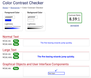
WCAG 2 level AA requires a contrast ratio of at least 4.5:1 for normal text and 3:1 for large text, and a contrast ratio of at least 3:1 for graphics and forms. Level AAA requires a contrast ratio of at least 7:1 for normal text and 4.5:1 for large text.
WebAim provides many great resources, information, and examples of color contrast. They explain, “In WCAG 2, contrast is a measure of the difference in perceived brightness between two colors (the phrase “color contrast” is never used). This brightness difference is expressed as a ratio ranging from 1:1 (e.g. white text on a white background) to 21:1 (e.g., black text on a white background).”
There are several tools online that allow you to check your color contrast, including WebAim’s own contrast checker. It’s helpful to know that whatever the contrast ratio is, will stay the same if the colors of the foreground and background are swapped.
#UseCamelCaseForMultipleWordsInAHashtag
Have you ever seen a hashtag where you can’t even figure out what it should read? Not only is this counterintuitive and bad for your brand, but it’s also inaccessible. Putting your hashtag in camel case – in other words, capitalizing the first letter of each word – can really help individuals distinguish the individual words in your hashtag and read it properly.
Additionally, when you do, it means screenreaders used by people who are blind or visually impaired will hear the words individually rather than as a long incoherent word, which is likely to be the case if no letters are capitalized.
 Descriptive and Accessible Links
When including links in your content, make sure that the link text makes sense on its own and is descriptive enough for a user to know where it is taking them. For instance, instead of using generic terms like “click here,” “see more,” or “continue” link the text to a word or several words describing the content. The content that you link to should also be accessible. If it’s not, consider choosing another link.
—
Take the first step to creating accessible content and get started today with captions and audio description.




 Color Contrast

 Descriptive and Accessible Links