Q&A: The “What,” “Why,” and “How,” of Digital Accessibility for Business
Updated: April 21, 2021
Inaccessible websites deter people with disabilities. In fact, 71% of individuals with disabilities will leave a website if they find it is inaccessible. So, how do you make a website accessible? Where do you even begin? What kinds of digital accessibility tools can your business use?
Larry Lewis is the Director of Channel Sales and Strategic Partnerships at The Paciello Group (now known as TPGi), and he knows a thing or two about digital accessibility for business. In the webinar, The “What,” “Why,” and “How,” of Digital Accessibility for Business, he covers the importance of accessibility and how to achieve it with any number of resources, defines just what accessibility is, and gives insight into your disabled audience. Finally, he emphasizes the importance accessibility since noncompliant business are at risk and overviews tools and services that will help drive your website to full-accessibility.
Below is a snippet from the Q&A portion of the webinar:
Could you define what a VPAT is?
LARRY LEWIS: A Voluntary Product Accessibility Template is an artifact of digital accessibility tools that a lot of organizations look for when they’re going to a vendor to determine whether or not what they’re investing in is accessible. So a federal agency, for whatever reason, needs to make sure that what they’re investing in has an element of accessibility built into it. So often, what they will do as part of their due diligence is they will go to a vendor site, and a vendor may have published that VPAT out there. It’s supposed to say, what is fully accessible [about the product], and if it’s not, what’s not accessible about it, and when might it be accessible.
The problem with VPATs is anybody sitting behind a desk can go through and create one and check things off and so forth. It doesn’t mean that it is. But when we provide a VPAT, we actually test everything. We test what it is we’re actually validating, then we’ll base our validation, our findings on what we’ve actually tested for. We legitimize the whole VPAT process and why it’s out there. VPATs can be tricky business, depending on if the vendor actually did what they were supposed to do for a VPAT.
VPATs can be very valuable to you if you’re trying to get into certain sectors, especially as it relates to federal business and those sorts of things. They’re going to look for a VPAT. They’re going to start to dig and ascertain. It doesn’t always work out this way, but in a perfect world, there’s not supposed to be– from a procurement standpoint, there’s not supposed to be procurement in inaccessible type of applications, unless there is a business need for it, and there is no other alternative out there. So a VPAT can be very valuable to, especially if you’re cleaning things up and making things accessible, it can be a way to get you into the government business.
How do I get buy-in from my organization to prioritize accessibility?
LARRY LEWIS: Focus pretty heavily on the fact that it’s the law. It’s not necessarily just a nice thing to do. And is it worth it to them to risk not being accessible and the fallout of what could happen than to just spending less money to become accessible and avoiding the risk of possibly paying legal fees and being made to do it anyway? I mean, unfortunately, you have to lean pretty hard on risk, which I wish we didn’t have to do that as much.
What are some of the most common pitfalls people make when they’re starting out with accessibility?
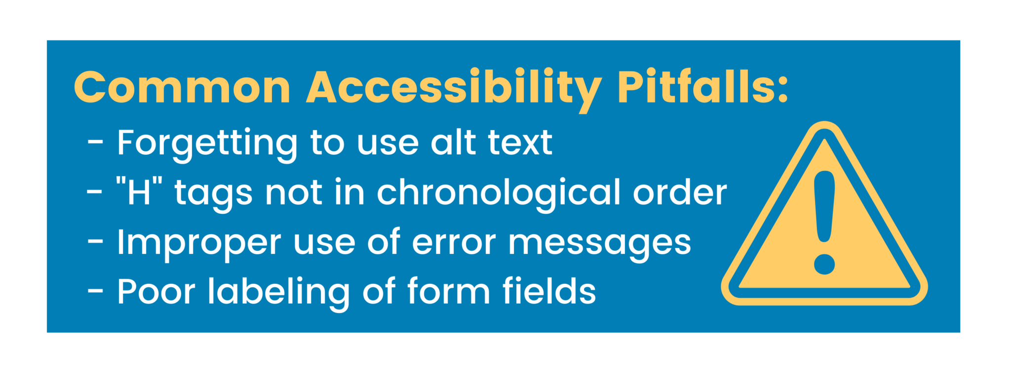
LARRY LEWIS: So there’s a few of them. Probably the first and foremost that people make is they don’t label their graphics. And so if I’m moving through a website, and I read your graphic, the screen reader’s going to read to me the file name, typically, unless you put alt text into that graphic. You go into the properties of the graphic and actually put a small label of text just telling me what it is. So it could be–it could be, “Larry shaking Sofia’s hand.” It could be as simple as that. It could be, “Larry and Sofia smiling.”
I tell people, think in terms of your alt text as a tweet–no more than 140 characters. You want to basically know what is being conveyed in that graphic, and if things get a little bit more intense, like it’s an alt text of an image of a graph or whatever, you can create long descriptions that can be read when the screen reader user presses the Enter key.
The second that happens, oftentimes, is form fields aren’t appropriately labeled. And so if I’m tabbing through a site, and I hear, “Edit,” I know it’s an edit field, but I don’t know what to put in that edit field. I don’t know if it’s a search field. I don’t know if it’s a login field for my first name. I don’t know exactly what that edit field is. The third thing would be, again, just along the whole labeling of the web elements, if I have an unlabeled one button, I don’t know if that’s a search button, a submit button, a login button.
So I would say graphics, labeling of web elements, and then probably making sure that headings, your H1 to your H6, your headings on a web page, those of us who are visually impaired use headings as quick ways to get around the web page. And so if you put like an H5 or an H6 at the top of your page, stylistically, I mean it might look OK to you. But I don’t want to hear any little thought at the top of my page. Typically, it doesn’t even have to be heading level 1, but as long as it’s somewhat sequential, like heading level 2, heading level 3, heading level 5, and you sort of maintain that chronological H tag order, headings are sort of like breadcrumbs, for those of us who are screen reader users, to jump around the screen pretty quickly.
The last one that I find quite a bit is error messages. If I make an error on a form or filling out something, and I press my Enter key, and I don’t direct the screen– I don’t program…the screen reader to go back to the focus of where the error message is, I could be sitting on my Submit button or whatever, pressing Enter, and nothing is speaking to me, and I don’t know what’s going on. Have I submitted my information? I mean there could be an error plain as day visually up higher, and if the focus doesn’t shift to that error, it could be really frustrating.
Those are four to get you started. I could go on and on, but I would say those are the top four I would think– your alt text, your labeling of web elements, appropriate labeling, making sure your H tags are in order chronologically, and then error messages.
Have you found that digital accessibility tools improve the experience for all viewers?
LARRY LEWIS: I think so, because if I have certain verbiage built in [to the website], it’s going to be helpful for somebody who can see. If I have a logical site, if I have a site that’s understandable, if it’s consistent across the entire domain, everybody is going to like that. Nobody’s going to be confused. So I think if you focus on consistency, and if it’s thoughtful, I also want to just say, in closing, I hate it when people dummy down a site for somebody who’s visually impaired at the expense of the visual user. You don’t have to do that.
Accessibility means accessing what everybody else accesses, not creating the separate but equal type site.
Make your site look appealing for your predominantly sighted audience. Accessibility means accessing what everybody else accesses, not creating the separate but equal type site. So make it look good. Make it consistent. Make it logical. Make it operable. And I think if it’s created in a robust way, it’s going to improve everybody’s experience. I mean, accessibility should not be a ball and a chain. It’s a little bit more level of effort to make an experience better for all.
Watch the full webinar!


